Start with a neutral palette…
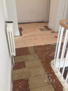
When we arrived at Treseren, we quickly realised that there was quite a lot of work to do. It meant taking up floorboards, re-wiring and re-plumbing to make all the bits behind the scenes do their job efficiently. In the process, we ripped out a very outdated bathroom with stained bath and no shower, and stripped back what I can only describe as ‘crazy’ wallpaper in the drawing room, taking the house back to its bare bones.


I can’t tell you how much I loved ripping that wallpaper down! As I stood there amongst the pared back plaster, the sweeping curve at the back of the room and the Georgian window with its original shutters just seemed to stand out. I could have happily embraced the distressed plaster as the final finish. This has become a really interesting interiors trend and is pulled off rather brilliantly by our friends Viva and Mark in the renovation of their stunning home. Have a peek inside the sitting room to see what I mean:

And here’s a close up of that unique and very beautiful plaster effect that we’re talking about.
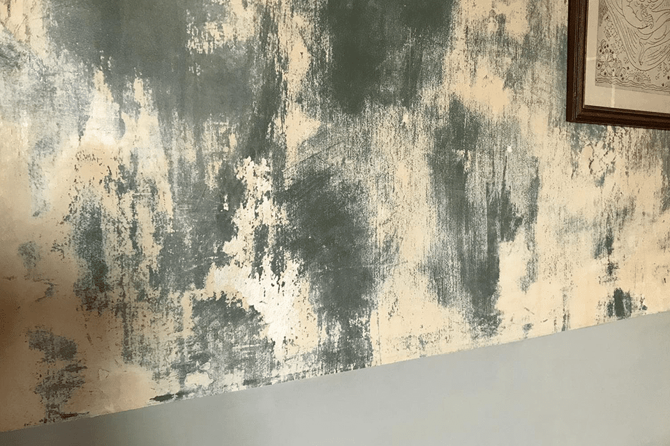
What do you think? I absolutely love it.
The great thing about this look is there is no need to paint (or agonise over colour decisions!) – just celebrate the raw beauty. In this case, Viva chose to paint the lower half of the room, in her words “to make it look like it wasn’t a mistake”. She went for a really beautiful grey that has a slight green background note to complement the plaster above. It anchors the space and makes that unique raw plaster finish sing beautifully.
Why grey has become a classic…
That’s the thing with grey. It’s just such a flexible neutral that works with anything. Some interiors trends come and go quickly, some run and run and end up as classic. And rightfully so in the case of grey. From warm greyed beige tones to light, cool neutrals, to striking dark anthracites, there really are fifty shades and you can pretty much find a perfect shade of grey for any situation.
I had been using greys for years in interiors projects and when it came to Shepherds House I wanted to keep the palette consistent and complementary to flow through the house, whilst still giving each room its own unique atmosphere.
What to consider when choosing the right shade for your setting…
When choosing any colour whether it’s a subtle grey tone (or a bright energising yellow if that’s more your thing), I think it’s really important to start with the idea of the feeling in the room that you want to create. So, in a palette of greys from warm to cool, if you want the room to feel cocooning and cosy, head for the warmer end of the spectrum or dare to go dark – which will have that same cocooning feel. For light, airy spaces, look for grey toned off-whites.
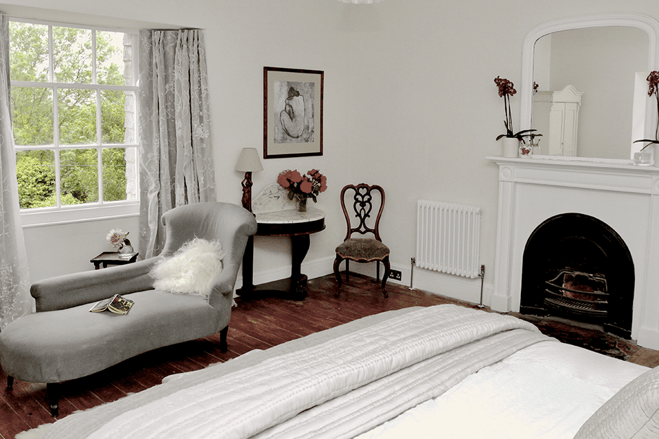
Lots of our guests have asked what colour the bedrooms are painted in Shepherds House – it’s by Farrow and Ball and called Strong White and despite its name, really is more grey than white and very subtle. It is the best neutral off white I have ever found, works in most spaces and achieves the feel of a beautifully light space without feeling too cold.
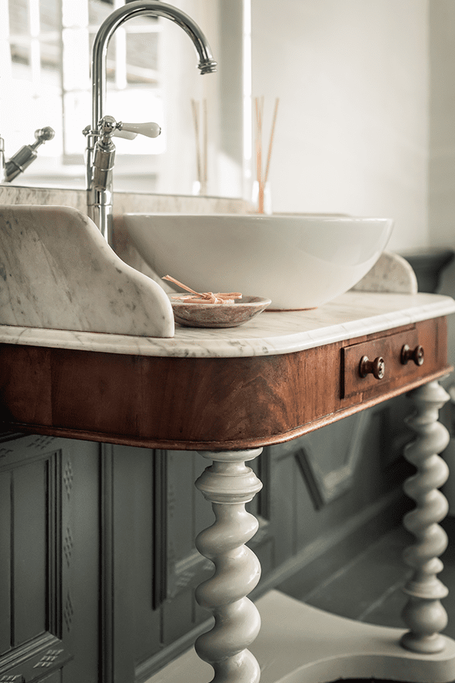
For the bathroom which was now equipped with an antique wash stand we had had for years and plumbed in with a modern basin, I wanted the room to feel both dramatic and cosy. The floor and panelling are painted in Farrow and Ball’s Downpipe, offset by Lamp Room Grey on the barley twist legs which I painted over a section of the mahogany wash stand.

The dark and dramatic Downpipe has grown in popularity but was originally put centre stage by designer Abigail Aherne when she famously painted her Islington shop in Downpipe from the ceiling, down the walls and on to the floor. And that was years before the trend for the dark side became a thing. If you’re not familiar with Abigail’s design work, immerse yourselves here.

Is it worth painting up test patches or can you choose off of a sample colour card?
Any paint expert will tell you that it’s important when deciding on the perfect shade to test patches on your walls. That way you can see how a shade looks in its own setting, rather than on a test card, and how the colour works at different times of the day, in different light.
I’m a big fan of painting up my top colour choices on to boards too and moving them around the room to get a sense of how the tones work in different places in the room. Usually just old planks, or off cuts of wood which (if you are building) are inevitably lying around. The thing to do then is to write the name of the colour on them so they look official and keep them hidden to one side so nobody on site thinks they are bound for the skip! Having mobile testers is also incredibly useful if you’re starting from scratch and you want to ensure key pieces of furniture will co-ordinate with your colour choice. When creating a scheme, I often pull my planks out in interiors shops and furniture show rooms and lay them next to items I am considering for a space.
Are the more expensive paint brands worth it?
Although not brand loyal, I am undoubtedly a Farrow and Ball fan and feel the depth, tone and pigment of paints created by F&B, Fired Earth, Little Greene and other heritage style brands can be hard to match with cheaper brands. That said, it is horses for courses and if I am painting an expanse of true white for example, I see no reason to splash out on expensive paints when you can easily find a great white with a cheaper brand.
Invest wisely in the right places is my motto. Having decided on a palette of greys for the Drawing Room at Shepherds House, which has an original dado rail and in my mind was crying out for two shades; one below and one above, I settled on Farrow & Ball’s Manor House Grey at the bottom for its depth and strength to anchor the room and Blackened White above. Cool and restrained, this scheme was chosen to celebrate the elegant nature of the room and off-set the curves of the black chair and sweeping arch behind the sofa. In this case, I felt the investment in the paint was worth it.
Mixing your own shade of grey – can it work?
When it came to the sitting room which is a light room with double aspect windows, wood burner and houses our two chestnut brown sofas, and antique deco arm chairs, I knew I wanted the perfect shade of warm grey which would balance the light and airy feel of summer with the cosy feel of the wood burner warming the room in winter. I cannot remember the exact colour I picked out from my Farrow and Ball test planks, because here’s what happened next. Our decorator, Mark Carter (who I have worked with for years on many projects and trust immensely) convinced me that he could match the colour I had chosen with a cheaper paint mixed by his local trade shop. I went with Mark’s advice – and can say I truly love the colour.

When I told Mark how much I loved it, he admitted when he first painted it on, the paint that had been mixed was much darker and very different to the one I had chosen, so he rectified the problem by adding some white, some grey from the Drawing Room tins already opened and in true mixologist style came up with the colour that now graces the room. I laughed and laughed. I wish we could take this colour and bottle it; it’s so stunning and changes through the day from a true grey in the morning light to a warm greige in the evenings when the fire is lit. But just as George couldn’t remember how to make his marvellous medicine, Mark has no idea how to re-create this stunning grey. I have named it after him; Carter Grey!
And as a footnote…
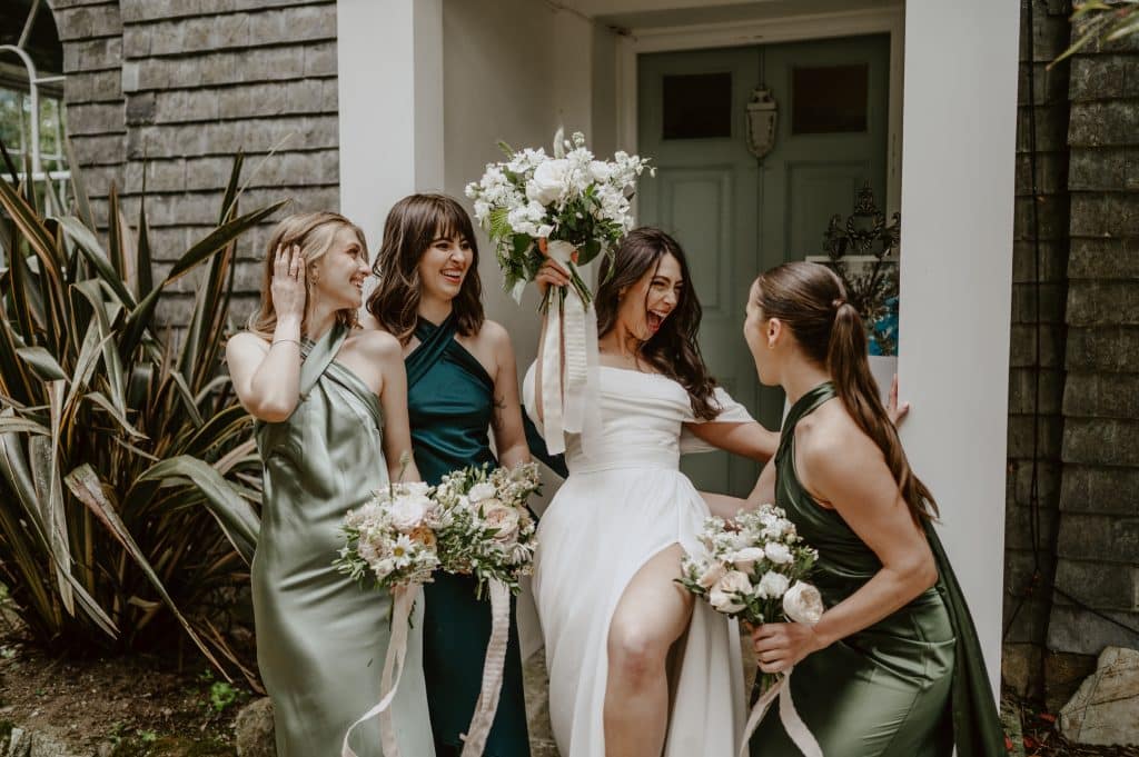
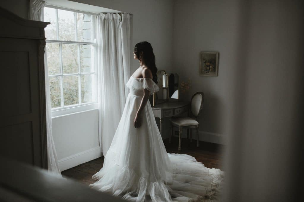
How a restrained palette of greys and whites suits Treseren’s new role as a small, intimate wedding venue in Cornwall.
For anybody wanting to cosy up in the sitting room whilst enjoying their elopement wedding, or for groups to gather and feel uplifted during an intimate wedding; spilling in and out of the house in summer, I hope the colour palette at Treseren is both energising and cocooning.
The neutral backdrop of greys and whites creates the base to overlay florals and special personal touches of decor that will sit in the background, allowing you to enjoy the spaces and put your own stylish stamp on your day, your way.